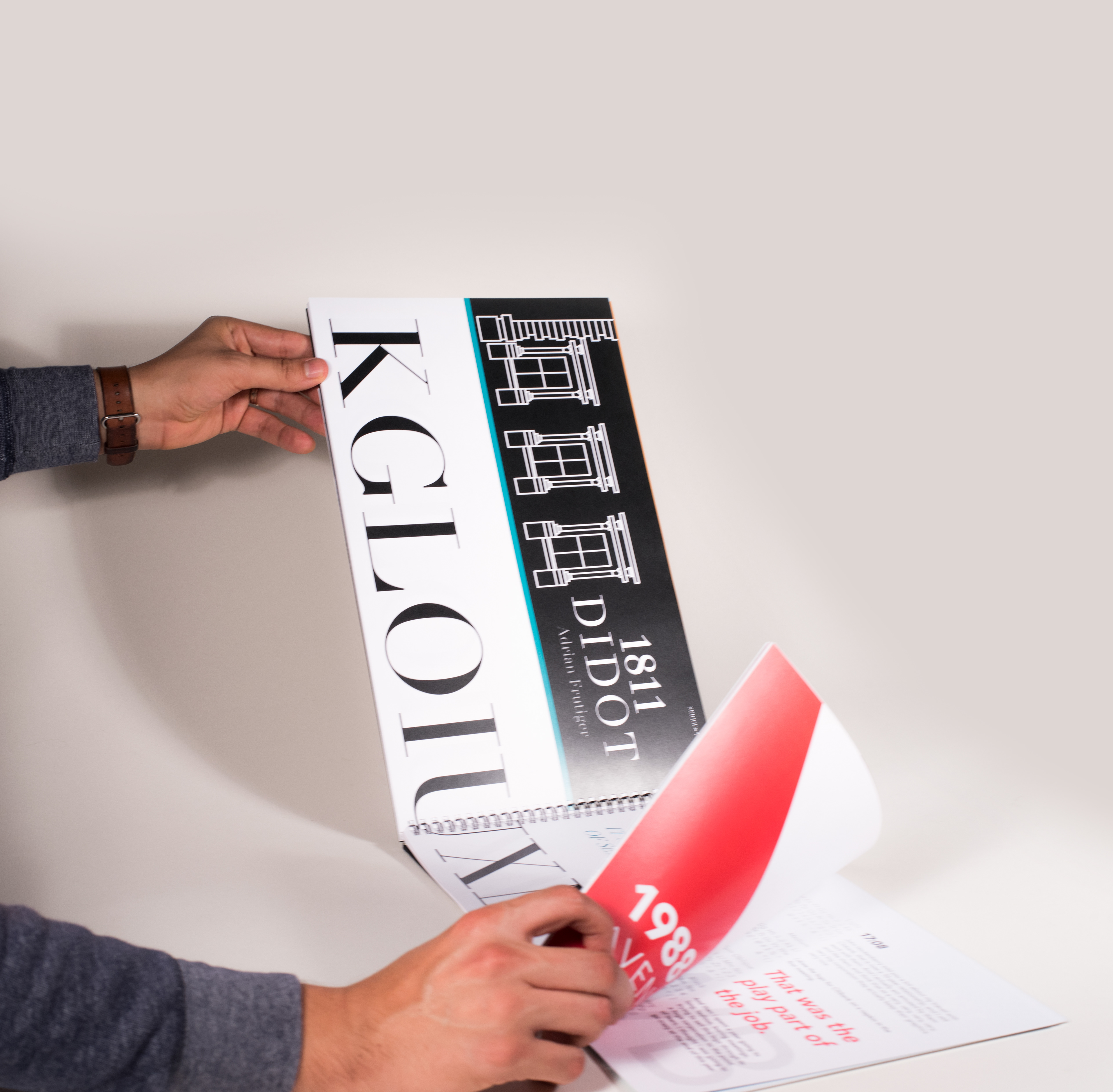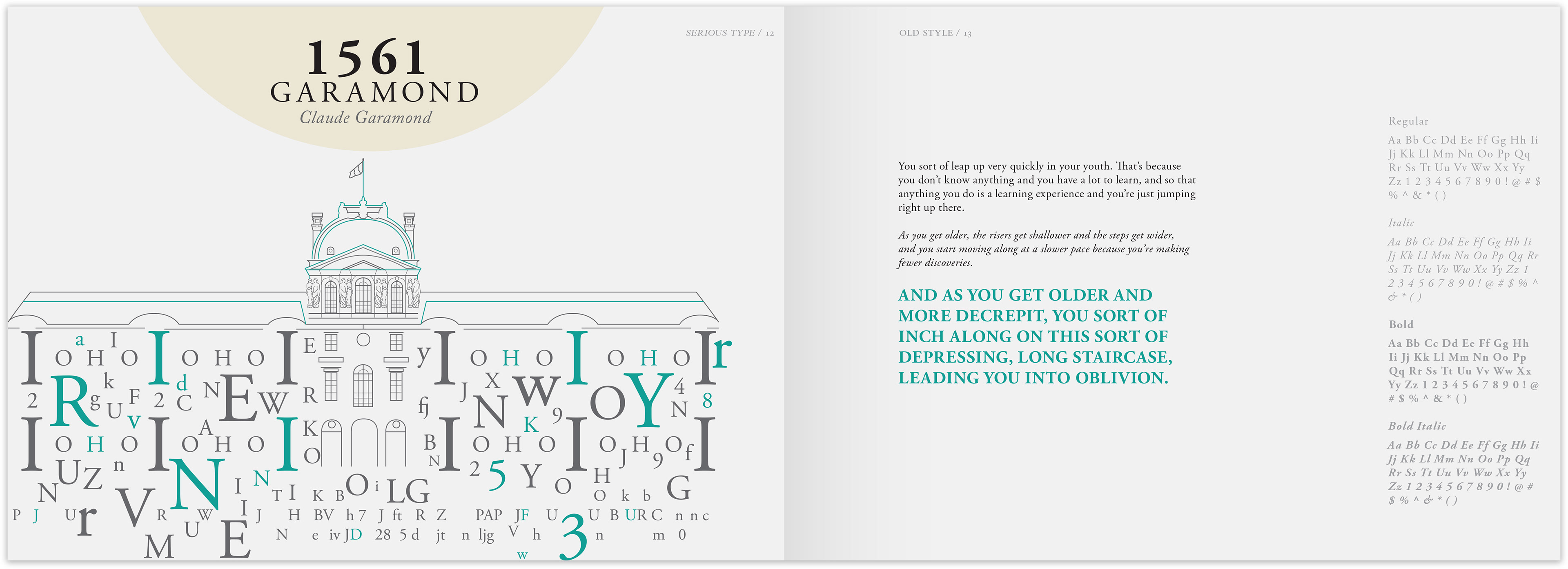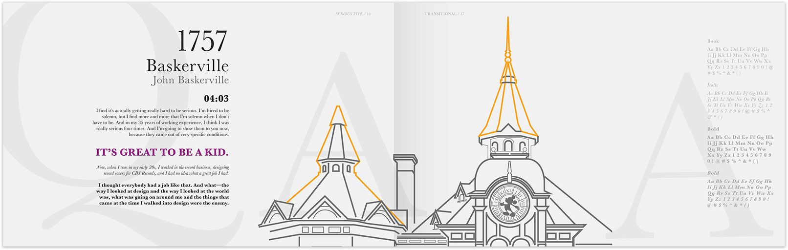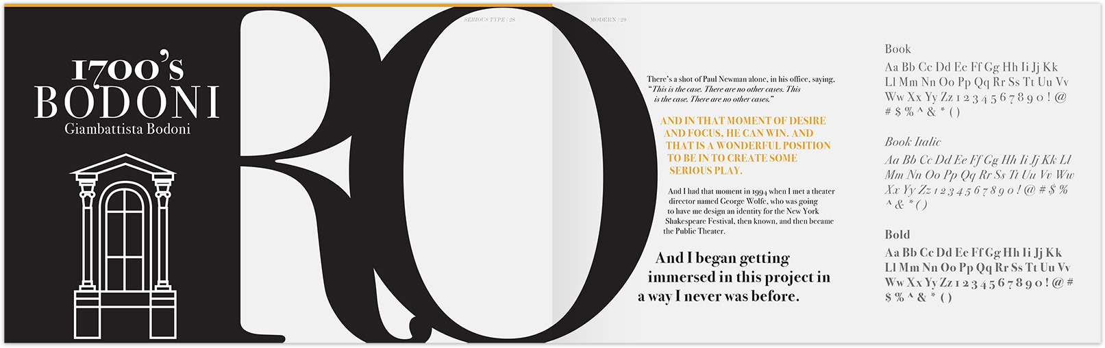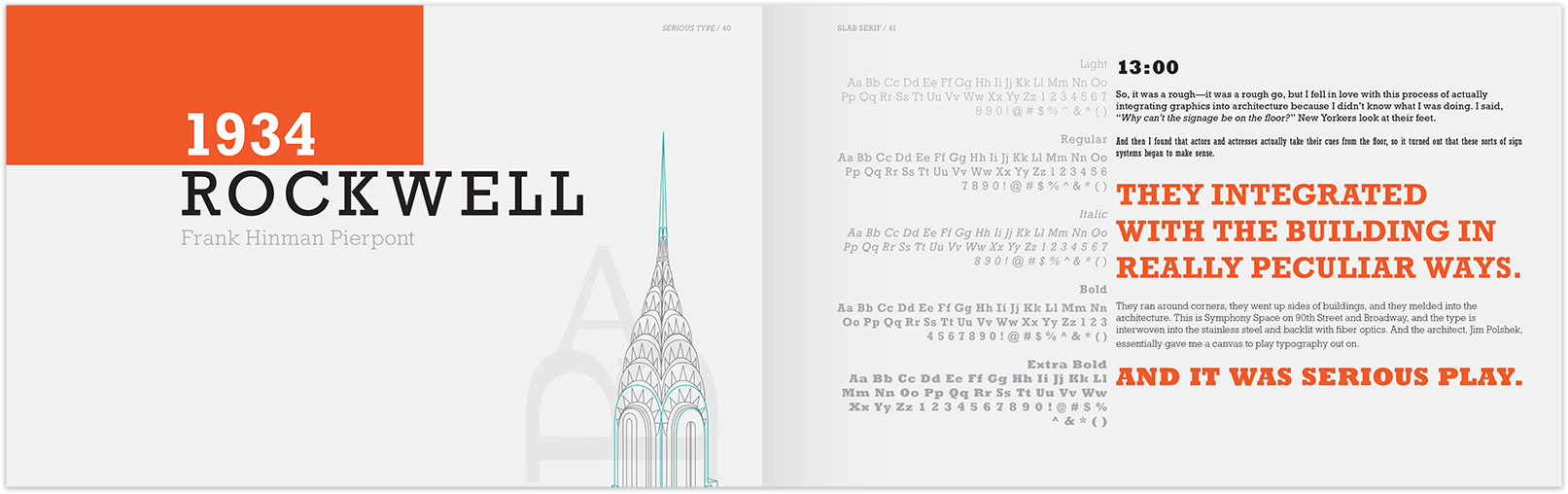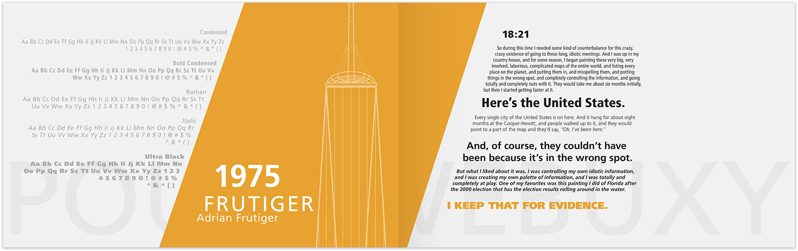


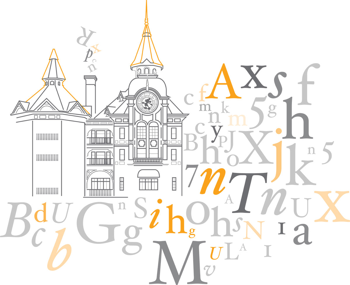
This font resource book is designed to showcase 5 different type families subdivided into 5 fonts for each totaling 25 different fonts. My approach to this 62-page resource book was to compare typography to architecture that relates to form and overall design. To supplement text for this book, I used the transcript from a famous speech from world-renowned designer Paula Scher entitled “Design is serious, not solemn” as a visual example to how each font works. Therefore, this book is intended to be a visual reference of the typefaces with its variations while incorporating the playful humor that makes up part of the speech. All of the architecture illustrations are original and based on actual monuments.
Process
The design process for this book needed a good amount of brainstorming to find an original idea to represent the speech and fonts in a visually engaging way. The idea of architecture came to me as I explored the type design from a historical standpoint. I made it a point to research when each font was designed and why it was designed for. Conversely, I looked to architecture that related either to the same time period to when it was designed or to an architectural style that evokes a similar solution to that of the font.
For instance, for some modern typefaces such as Bodoni and Bernhard were designed during the 1700’s fueled by the rise of print technology. With regards to architecture, a symmetric Palladian approach was common which relates visually to the modern design fonts. This is just one of many examples that are used throughout the book.
Design
When it comes to the grid format and color options, I opted to design a variable grid that would relate to the font family and/or the building that the font was associated with. Moreover, I limited the color choice to only one per font as a highlight color in contrast to black and gray.
The goal was to isolate each font per page spread to avoid confusion and avoid clutter. I focused on creating a book that can be both practical to use when searching for font uses while at the same time making it attractive to look at.