Research
Before delving into visual field examples, I needed to research the topic thoroughly. I selected a science journal (“Wines of Baja Mexico: A qualitative study examining viticulture, enology, and marketing practices” by Javier Covarrubias, Published Dec. 2015 on sciencedirect.com) that specifically addresses the soil and crop growth in the wine area of Baja as a baseline for an objective comparison to Napa Valley. Moreover, I used several travel articles to obtain price information, offered amenities and popular vineyards. This allowed me to obtain a solid understanding of what the Baja wine region offers and how to compare it to Napa Valley.
For the visual field, I selected both personal and found photographs of the area that depict the natural surroundings along with imagery of wines and food local to the region. I used colors that are warm with a touch of cool blue since the wine region is relatively close to the Pacific Ocean.
Target Audience
The intended audience is directed towards travelers looking for cultural experiences that includes gastronomy and viticulture. It can be a young professional looking to expand his/her understanding of viticulture, a wine business owner that is seeking to add new vintages to his/her wine shop or anyone else looking to explore Mexico under a different light.
Execution
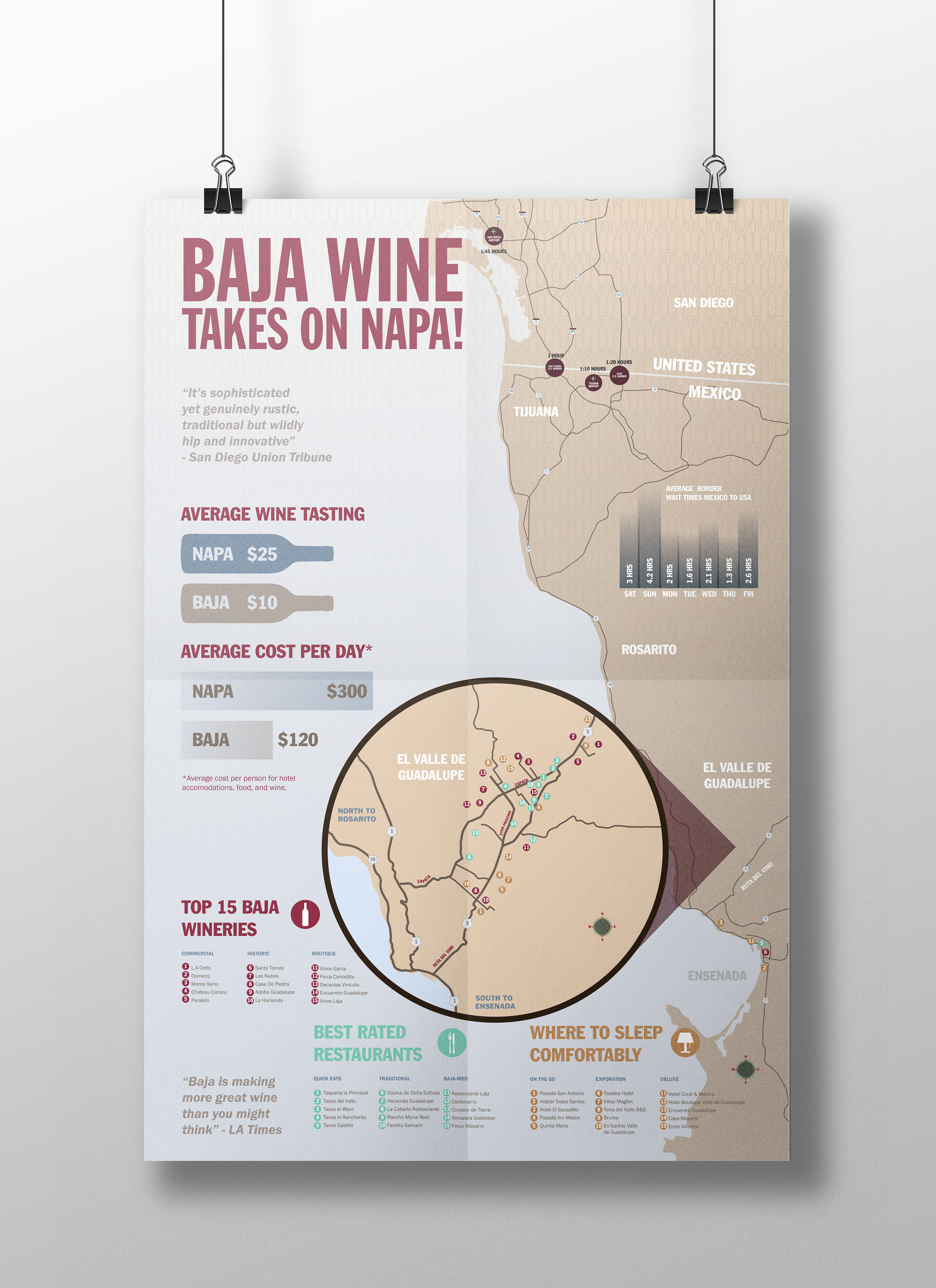
The design elements that I created are a series of icons that represent the various amenities that are offered in the wine region of Baja. For instance, for the poster design, the infographic is primarily a map with specific areas highlighted for traveling information such as wineries, hotels and restaurants. Each category focuses on three different options in order to give a potential visitor the necessary information to plan the trip according to their preference. In addition to this, the poster takes advantage of the real estate to showcase a large map indicating routes and travel times along with cost information.
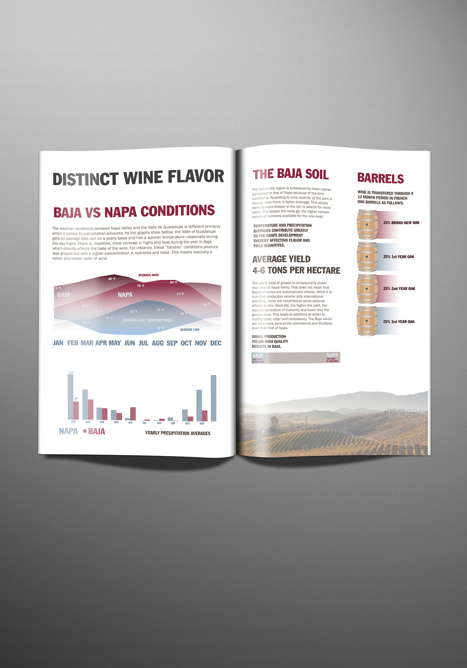
The brochure summarizes various subjects that is more directed towards a potential reseller of wine. For instance, one part highlights the weather conditions that make Baja unique for wine production and how it comperes to Napa. Furthermore, it summarizes the overall tourism and potential growth. Lastly, it summarizes all the various types of grapes and wines that are made throughout the valley.

The website features a basic interface that is purely informational. It features an interactive map and supporting information that is also found in the poster and the brochure.
Overall, the goal was to create a cohesive system that works well in a variety of mediums such as large print production, brochure print production and a web application. This is important in order to maintain a clear visual identity to any potential viewer of the material.

