Process
The process to find a style, grid, and book layout was very complex. Given that the project serves as a typographical exploration, rather than a commercial product, the freedom to design is vast and limitless even if restricted to use two colors and basic graphics.
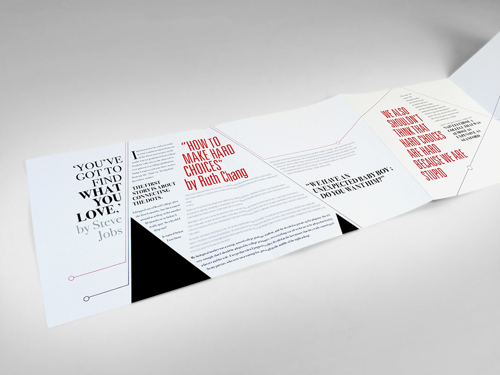
Since both speeches have to do with life decisions in spite of difficult or even unexpected circumstances, the idea of travel and timeline resonated with me as a unifying factor between both speeches. Thus I attempted several iterations that would reflect the tension, unpredictability and finally the need to choose a path. I explored this by creating various grid styles and paragraph compositions.
Design
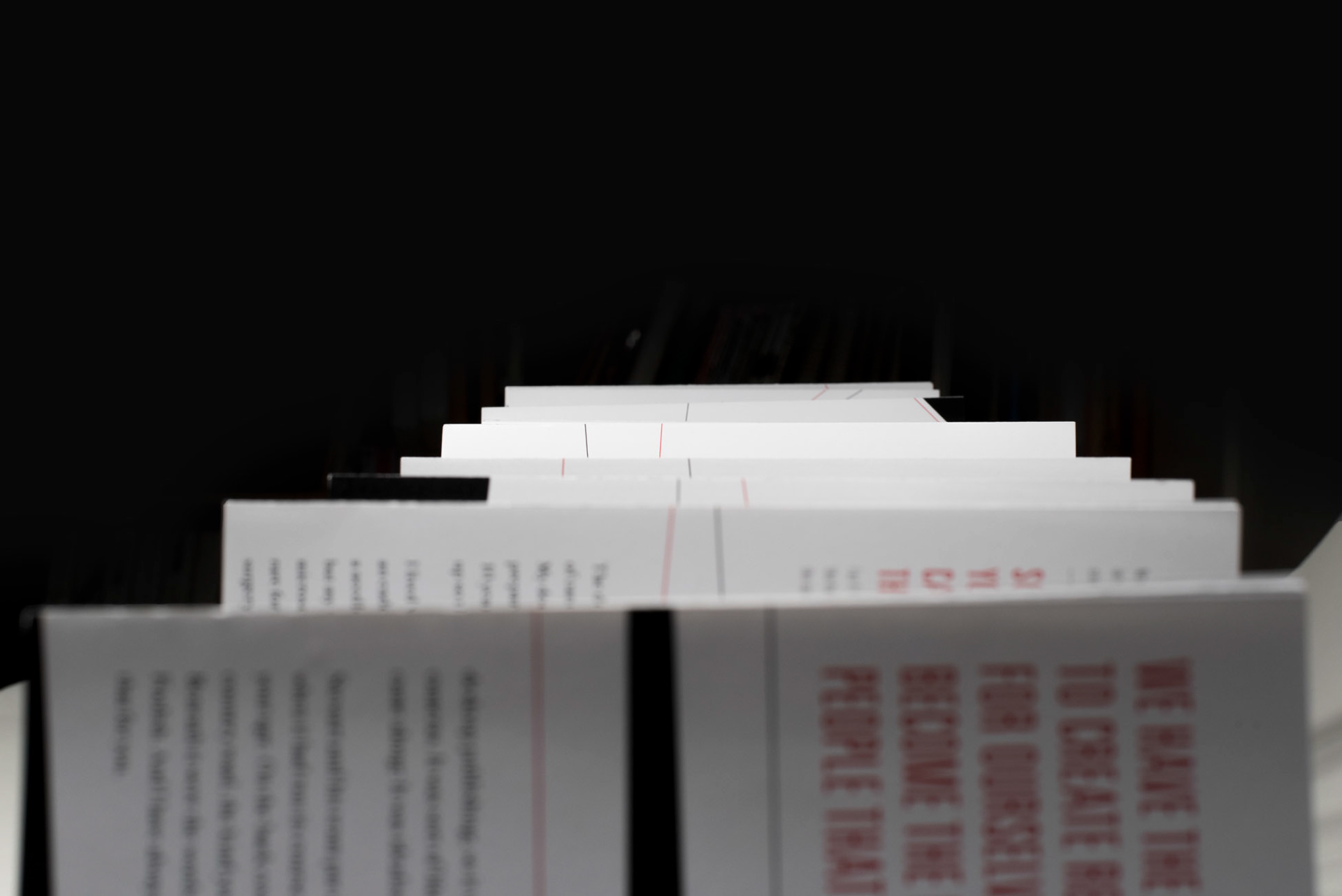
The design elements that I ultimately chose to evoke the idea of time and travel was two different colored lines that crisscrossed each other with a circle representing a time and place as the path continues to guide to the end of the speeches. Both lines initially start at a similar position yet both lines continue parallel to each other towards the end of the book without a definite end. This is meant to symbolize that different life paths that one can take.
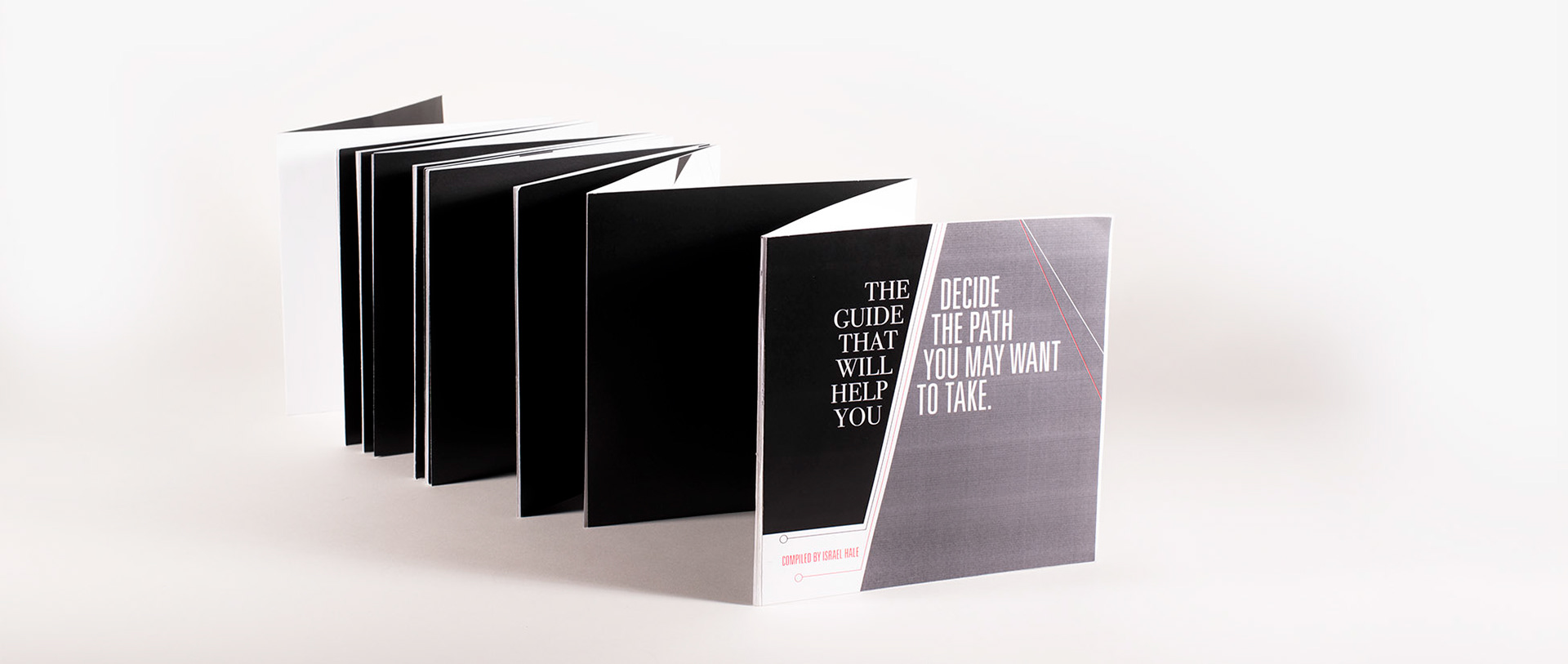
I opted for an accordion bound book in order to emphasize that idea of time and travel and to visually engage the viewer throughout the both of the speeches.
For the transcripts I chose to contrast a serif font with a sans-serif font in order to avoid confusion with the two different speeches. The grid changes from page to page and is highly dictated by the two colored lines that guide the viewer throughout the entire book. Thus the grid expresses emotion, tension, and rhythm.
This project allows a viewer understand the power of typography and how type systems can manifest the emotion that a live speaker uses when presenting and argument. Lastly, it helps the viewer understand creative solutions available with typographical layouts.


