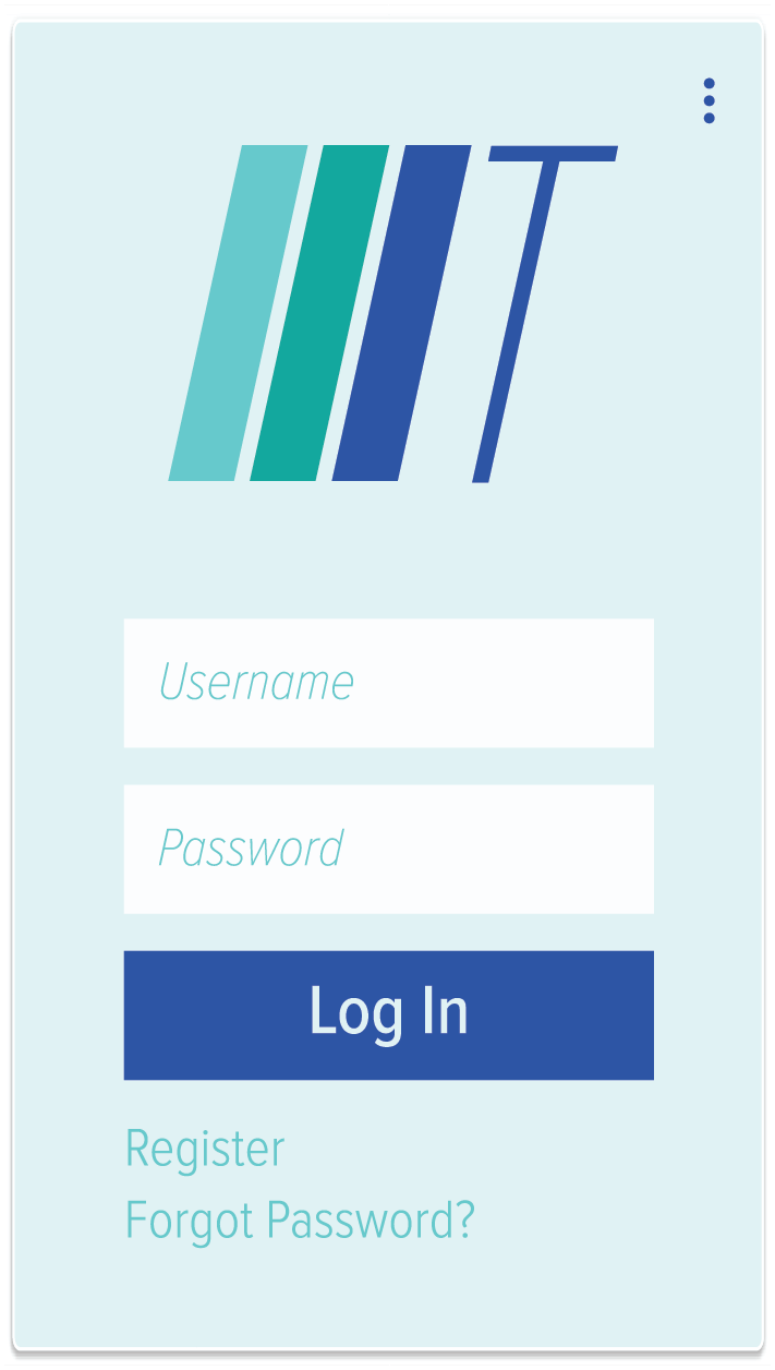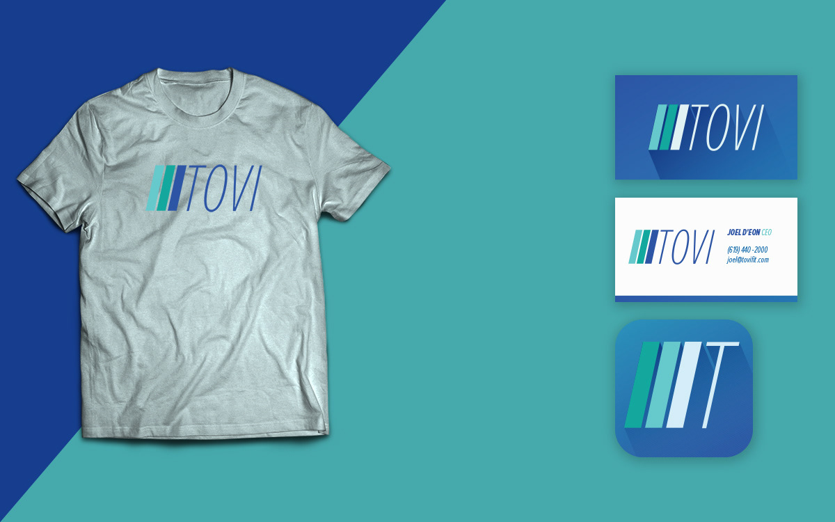
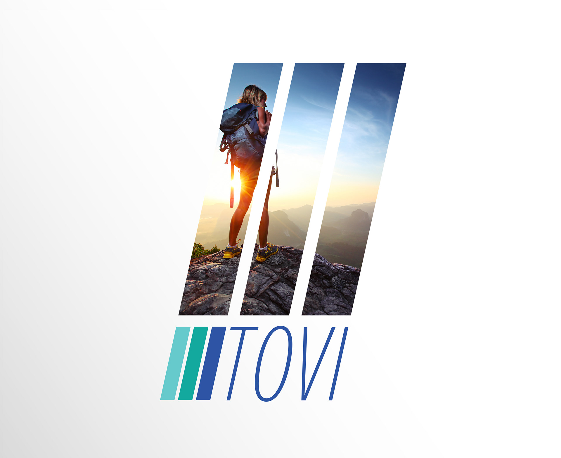
TOVIfit is looking for new visual options and name change suggestions to better appeal corporate business employees to use their products for their own personal health benefit. Thus, my solution for TOVI includes simple line elements along with a cool color palette that borrows from their current design. I decided to drop “fit” from TOVI and leave the initials as the main brand element. However, I incorporated a simple way to add subcategories such as health, wellness and strength next to the main logo design. Since popular gyms often use bright and high contrast colors, then a cool color palette seems appropriate to better achieve TOVI’s goals to be known as a wellness company rather than associated with a gym membership. The skewed three-line design is meant to highlight movement along with the 3 core areas of TOVI; namely health, strength and wellness. The clean and thin font is to add contrast to the line design while maintaining a contemporary look. The logo and colors are quite versatile as the app icon shows and alternative color variation using the same palette slightly inverted to accommodate a dark background while keeping brand identity quite uniform.
Research
My research involved examining various companies that are offering similar services to get an idea as to what would fit in the market yet maintain an original approach. I found that many blues and greens are used. The client’s desire was to steer away from something that would look like a gym membership. Instead, it aimed to attain a look that lives well in the wellness world and can be versatile to include various sectors beyond exercise and nutrition.